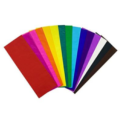
In the packaging and printing industry, packaging color plays a very important role. Today, I will take you to understand the contrast characteristics and specific application of packaging colors, focusing on the systematic application of contrast relationships such as color brightness, hue, purity, cold and warm in packaging, and highlighting the free use of various contrast laws and their application effects. The idea of laying a good foundation is to increase the market share and competitiveness of the company’s products in sales.
In economic and social activities, commodity packaging is an important part of commodities. It is not only an indispensable coat for commodities, but also plays a role in protecting commodities, facilitating transportation and sales, and is also a microcosm of the image of commodity manufacturing enterprises. As an important element in commodity packaging design, color not only plays a role in beautifying commodity packaging, but also plays a function that cannot be ignored in the process of commodity marketing. According to the analysis of relevant data, when the human visual organ observes an object, in the first 20s, the color perception accounts for 80%, while its shape only accounts for 20%; after 2 minutes, the color accounts for 60%, and the shape accounts for 40%; after 5 minutes, Half and half. From this point of view, the first impression of packaging is the visual impression of color, which can arouse the buyer’s attention, association and imagination of the product, thereby generating the desire to buy. It also proves that the color design and application of commodity packaging play a pivotal role in the packaging of commodities, and it can bring great visual enjoyment to people if handled well. , if used properly, it will increase the value of goods, and improve the market share and competitiveness of enterprise goods in sales. To correctly handle the color of product packaging, first of all, it depends to a large extent on the use of color contrast and harmony, because color plays an important role in setting off the theme, beautifying the product, and making it easier for consumers to identify the product.
In the packaging design of commodities, the design and treatment of color is one of the important factors of the external image of the commodity. It is the direct advertisement of the commodity, and it is also an important factor that is easy to impress people and attract customers. Therefore, the treatment of packaging color is an important factor in packaging design. means. In the specific design and application of packaging color, according to the formal rules of color aesthetics, the contrast of colors is not used in isolation, but is considered comprehensively in combination with other formal elements, but the color contrast is a fundamental factor, so this paper Let’s discuss this.
1 Contrast of packaging colors
To study the contrast phenomenon of packaging colors is a rational understanding of color visual laws on the basis of sensibility. Except for the time-continuous complementary color contrast effect of color visual afterimage and color-light adaptation phenomenon, it can be said that all color contrasts occur in the visual simultaneity effect, because most of the color contrast phenomena seen by people occur at the same time. Next, the contrast of packaging colors should be discussed in accordance with this visual law. In short, the comparative study of packaging colors is about contradictions, finding gaps and the relationship between colors.
The “pair” in the comparison has the meaning of being double and facing each other; Applied in the color category, that is: when two or more colors are put together to compare clearly visible differences, their mutual relationship is called color contrast relationship, or color contrast for short.
“2 or more colors” is the basic condition for the formation of color contrast. The so-called color refers to the three elements of area, shape, position and color, which are not clearly distinguishable by the optic nerve. Only two or more color units can be called pairs, otherwise there can be no comparison factor.
“Putting together” is the second condition for color contrast. Together, we mean being in the same time and space, that is, at the same time and in the same field of view. Only when the meanings of time and space are combined, can the similarities and differences be accurately found and the due contrast effect can be fully displayed. Otherwise, the visual impression will be indifferent or even disappear, and the comparison will lose its meaning.
“Comparing clearly visible differences” is the third condition that constitutes color contrast. The comparison of things is always carried out in the same category, the same nature or the same development stage, such as weight to weight ratio, volume to volume ratio, straight line to straight line, shape to shape ratio, etc. Otherwise, such as weight to volume, straight line ratio Shapes, etc., are impossible to compare and lose the possibility of comparison. Furthermore, the comparison of colors is also the same. In the category of color, it can only be the ratio of lightness to lightness, hue to hue, and purity to purity. Moreover, the same unit and area are used as the basis for comparing lightness, hue and purity. accurate conclusions cannot be obtained.
The result of the comparison must be that the difference is clearly visible. If the difference is not clear, the optic nerve cannot feel it, and the conclusion can only be that the brightness, hue and purity of these colors are basically or exactly the same. From a conceptual point of view, putting together basically the same color should be called the sameness and repetition of the color, but not the contrast.
Among the conditions that constitute color contrast, color difference is fundamental. Due to the universality of color differences and the characteristic that there is no vision if there is no existence, color contrast is also universal. The difference between colors also varies greatly due to the nature, degree and effect, so it constitutes the particularity of color contrast.